

Image Designer interface & overview
Explore the Image Designer interface in Productsup: the toolbar, product serach, image preview, and editing tabs.
How to navigate and access Image Designer
Please loging into the Productsup platform. Next, please do:
Go to a desired Site in your Organization.
Open the site's main menu on the left.
Access Image Designer.
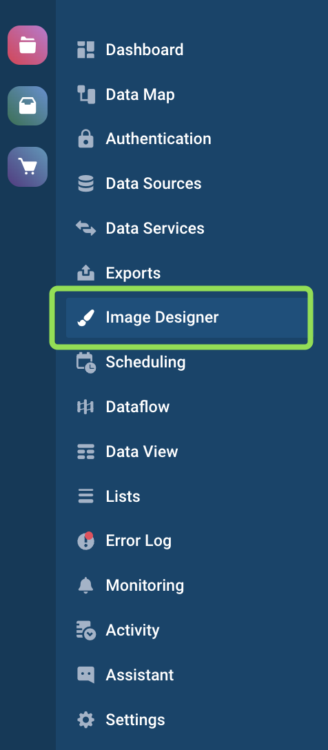
Image Designer interface
Image Designer consists of:
- Toolbar
- Image preview
- Editing tabs
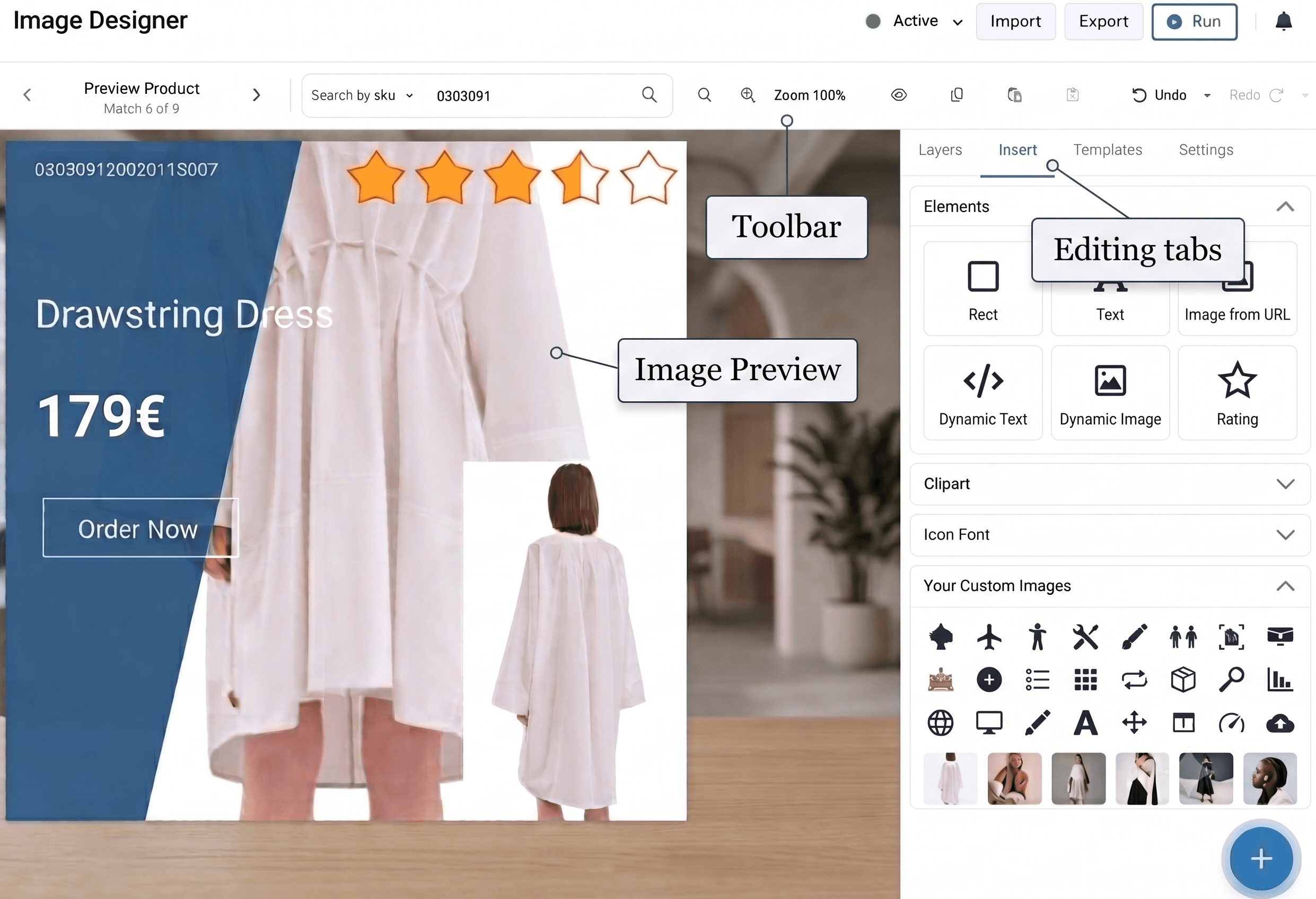
Toolbar
The Image Designer toolbar buttons allow you perform the following:

- The Preview Product arrows take you to the next or the previous product in your feed. Use it to preview how the designs apply to the images.
- The Search by allows you find a specific product in the feed and preview the design instanteniously. You might want to search by SKU, ID, GTIN/EAN code, or even a Title, Theme, Product Line - the search is flexible, it will return all the matching products, and you can use the Preview Product arrows again to view all the images and decide if you are happy with the design.
- The zoom-in (+) and zoom-out (-) buttons let you increase or decrease the image preview size.
- The "Eye" icon lets you show or hide elements that are out of the design template frames.
- The Copy and Paste icons let you copy and insert a selected layer.
- The Save, Undo and Redo buttons perform the respective actions. Revert & repeat actions apply to your last actions, and you can choose a specific action from the drop-down menu.
Image preview
The area below the toolbar displays a selected product image and all the applied layers. You can move, resize, and rotate the layers over the image as desired.
Image Designer lets you preview only the first 50 images of your feed. If you wish to preview a specific product, please use Search by feature in the Toolbar.
Editing tabs
On the right side of the Toolbar, you can find four (4) Editing tabs:

- Layers is a list of transparent sheets that lets you edit separate design elements. See Layers tab for more details.
- Insert represents different sets of elements - such as text, images, shapes, clipart, and icons, and the image uploader. All of these you can embed into an image template. See Insert tab for more details.
- Templates is a collection of the default templates offered by the Productsup platform and your custom templates. See Templates tab for more details.
- Settings for the entire template. See Settings tab for more details.
Layers tab
Layers are the first tab in the Image Designer. Layers are transparent sheets that let you edit separate design elements. Every new element you add to the template in Image Designer appears as a separate layer.
Actions with Layers
You can perform the following actions with layers:
- Change a layer position in the list by dragging and dropping it with the help of the left handle.

- Rename layers with the "pen" icon.
- Link and move several layers simultaneously. To do so, select the link icon for each necessary layer.
- Hide a layer with the "eye" icon to reveal the layer beneath it.
- Delete a layer with the "bin" icon.

Layer types
Image Designer creates the following layer types when dragging elements from the Insert tab to the image template preview area. Each layer type has its specific settings.
- Rect, or Rectangular is a layer for the Rect element from Elements.
- Text is a layer for the Text element from Elements.
- DynamicText is a layer for the Dynamic Text element from Elements or a clipart item from Clipart.
- Image is a layer for the Image from URL element from Elements.
- DynamicImage is a layer for the Dynamic Image element from Elements.
- CustomImage is a layer for images uploaded in Your Custom Images.
- Icon is a layer for an icon selected from Icons.
- Rating is a layer for the Rating element from Elements.
Insert tab
Insert is the second tab in the Image Designer. Insert lets you add shapes, descriptions, graphical elements, clipart, and icons or upload custom images. You can drag and drop a necessary element to the preview area. Each added element creates an individual layer in the Layers tab, where you can edit it.
The Insert tab consists of the following sections:
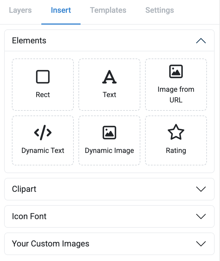
- Elements is a set of graphic elements, texts, and custom images.
- Clipart is a set of clipart images.
- Icon Font is a set of icons.
- Your Custom Images is a tool for uploading and saving images in a library.
Templates tab
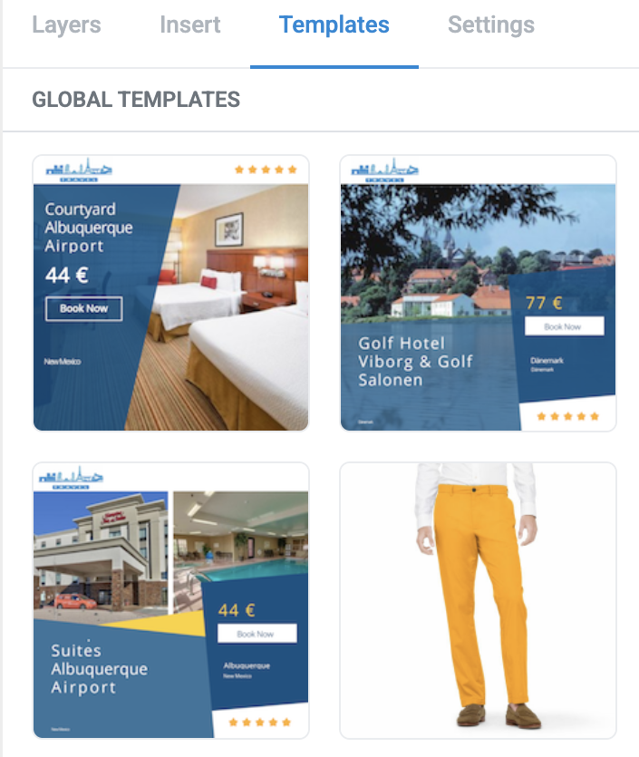
Templates is the third tab in the Image Designer. It consists of two sections:
- Global Templates - a set of default image templates offered as an example by Productsup. It might be easier to start up with selecting pre-saved Global templates, edit those, and later save them as your custom templates.
- Your Templates is a list of your custom image templates. You can edit, rename, or delete your custom templates, copy them to another Site, or share them over the Projects or for the entire Organization. You can also switch between the All, Intermidiate level, or Export level templates here.
Settings tab
Settings is the fourth tab in the Image Designer. They apply to your entire active design template:
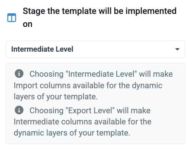
- Select the Stage the template will be implemented on in Productsup:
- choose Intermediate Level to make import-stage columns available for your template's dynamic text and image layers;
- choose Export Level to make intermediate-stage columns available for your template's dynamic text and image layers.
- Add a Grid to align elements in the preview. You can select the variants:
None,10, and60. The grid appears only during editing and doesn't appear on the final image.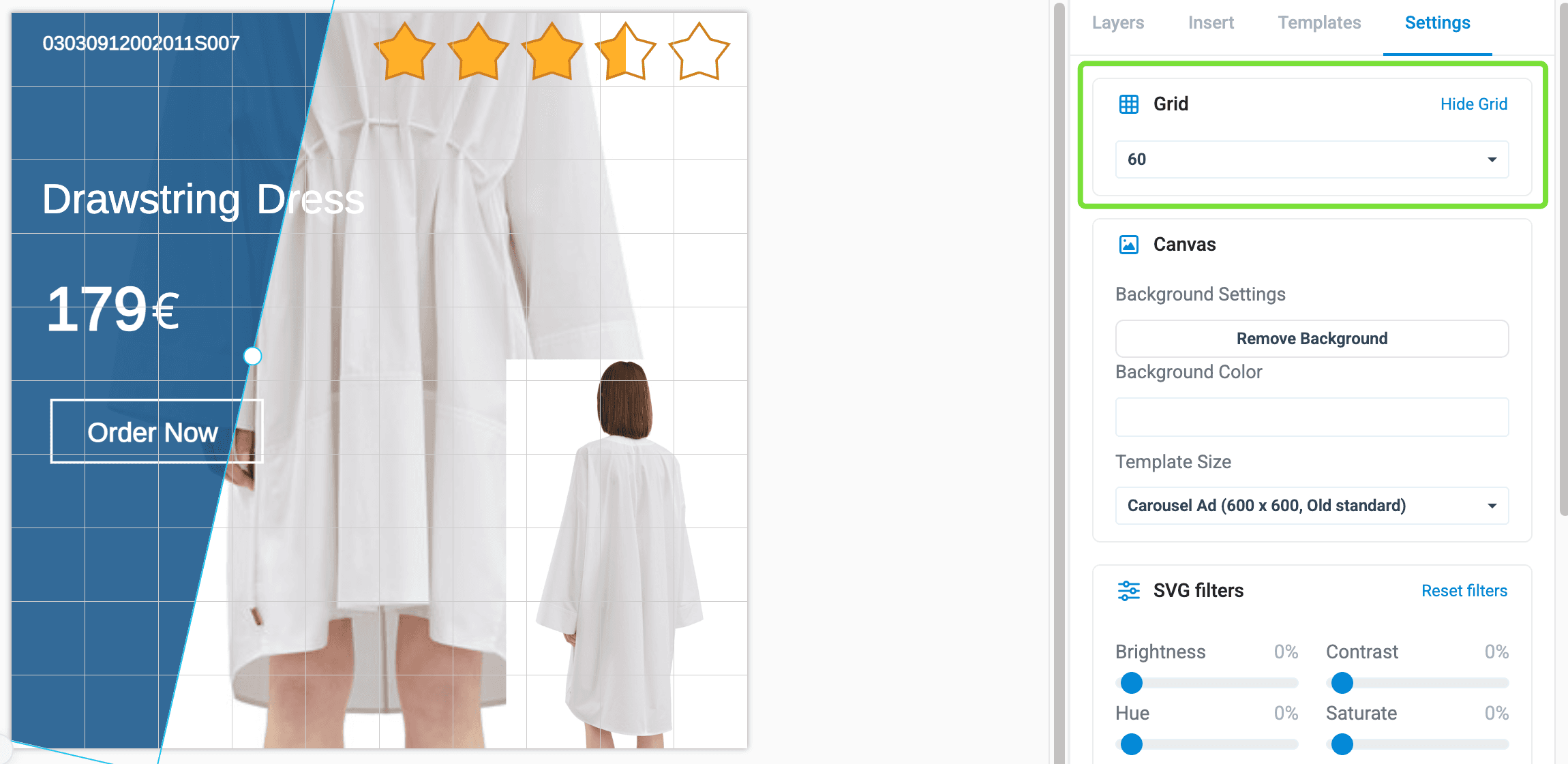
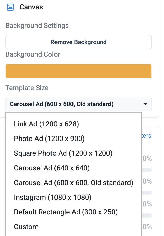
- Change the Canvas settings - choose the Background as HEX or RGB code or the Template size to ensure the format meets the requirements of the export channel. The Template Size drop-down shows pre-defined template types and sizes in pixels.
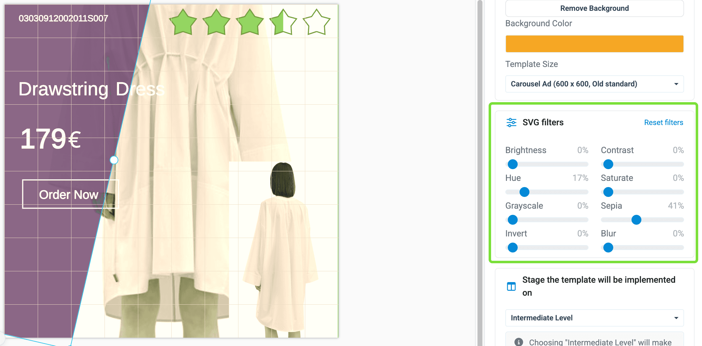
- Apply SVG filters to all the layers simultaneously:
- Reset filters resets all your filter settings for a layer.
- Brightness increases the image brightness.
- Hue changes the image coloring.
- Grayscale converts your image to black and white.
- Invert inverts the colors.
- Contrast increases the image shades.
- Saturate increases the image saturation.
- Sepia adds the sepia filter to the image.
- Blur softens the image.
How is this guide?