Dashboard at the organization, project, and site level
Use Dashboard to get a complete overview of your sites' performance in Productsup.
Dashboards provide a comprehensive overview of your sites' performance, including the number of imported and exported items, site run times, export readiness scores, warnings, and errors during site runs. Each level (organization, project, and site) has its own dashboard that you can access by selecting Dashboard in the main menu.
Organization dashboard
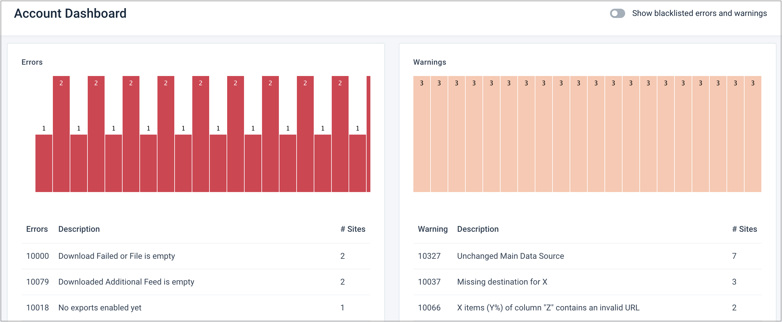
The dashboard at the organization level provides an overview of errors and warnings from all your projects and sites. To access the organization dashboard, take these steps:
Go to the organization level in one of the following ways:
Select your organization name at the top of the main menu (highlighted in red).
Select your organization name in the breadcrumbs (highlighted in blue).
Go directly to the link ending with your organization ID, for example,
https://platform.productsup.com/overview/account/123456.

Select Dashboard in the main menu.
Project dashboard
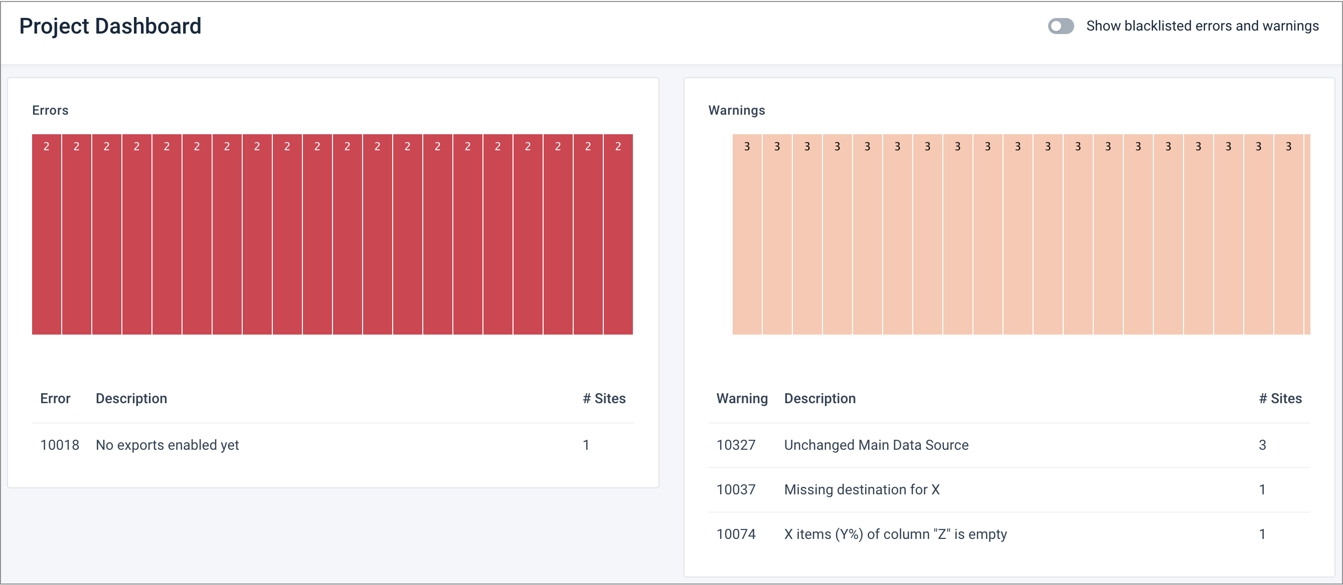
The dashboard at the project level provides an overview of errors and warnings from all sites belonging to one project. To access the project dashboard, take these steps:
Go to the organization level in one of the following ways:
Select your organization name at the top of the main menu (highlighted in red).
Select your organization name in the breadcrumbs (highlighted in blue).
Go directly to the link ending with your organization ID, for example,
https://platform.productsup.com/overview/account/123456.

Select the name of the project whose dashboard you want to view.
Select Dashboard in the main menu on the project level.
Site dashboard
The dashboard at the site level provides an overview of an individual site's most important metrics. It provides quick access to the features that let you fix errors and improve your data feed. To access the site dashboard, go to the needed site. By default, you land in Dashboard when you open a site from the project or organization level.
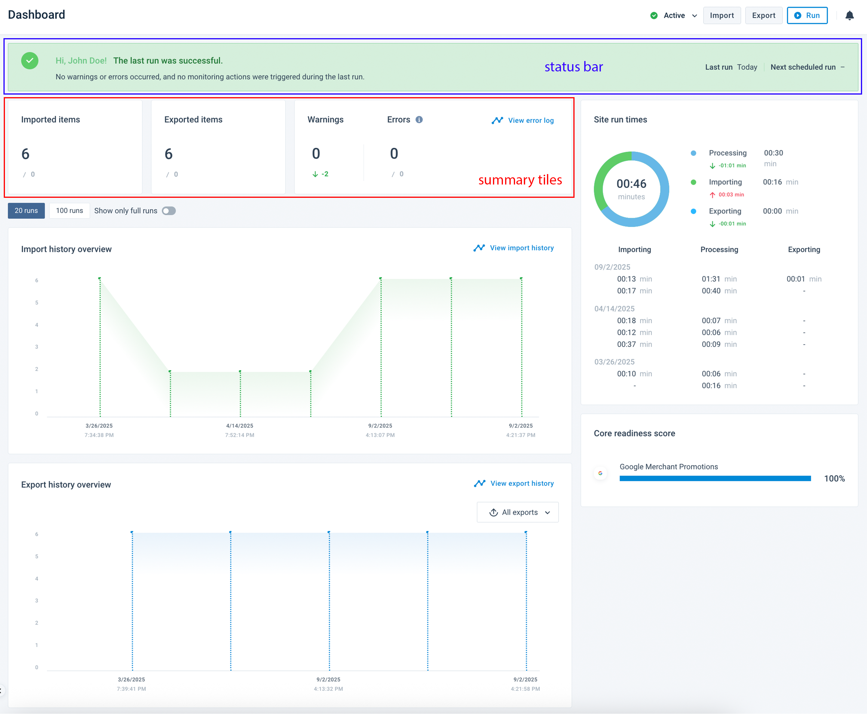
The site dashboard consists of the following sections:
Status bar
Summary tiles
Core readiness score tile
Site run times tile
Import and export history graphs
Status bar
The status bar gives you a quick impression of your sites' vitals without going into too much detail.
When you've just created a new site and haven't set up data sources or exports yet, the status bar shows your next steps:

When you set up your data sources and exports and start running your site, the status bar shows one of the following messages after each site run:
A green status bar means that the last run was successful, and you don't need to take any actions.

An orange status bar means that some warnings occurred during the last run, and you need to check the error log for more information. In the warnings and errors tile, you can see the number of warnings and check them in detail by selecting the link View error log.

A red status bar means that some errors occurred during the last run, and you need to check the error log for more information. The presence of errors means that the last run failed. In the warnings and errors tile, you can see the number of errors and check them in detail by selecting the link View error log.

On the right of every status bar, you can see the date and time of the last run and the next scheduled run.
A red exclamation mark appears between the last and next run if no export or destination is active. Hover over it to see the explanation. Then, go to Exports to activate your export or destination.

Summary tiles
Below the status bar, you can see three tiles giving you a snapshot of the most critical site metrics:
The Imported items tile shows the number of imported items. The number below shows the difference from the previous run and if it increased or decreased. 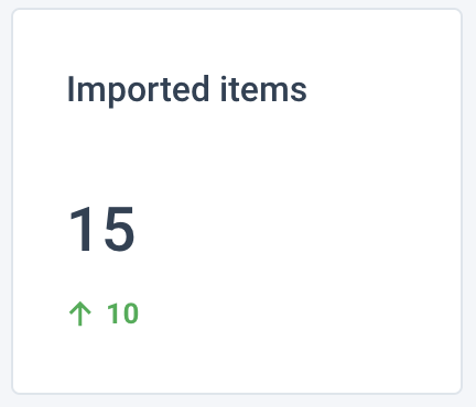 | The Exported items tile shows the number of exported items. The number below shows the difference from the previous run and if it increased or decreased. 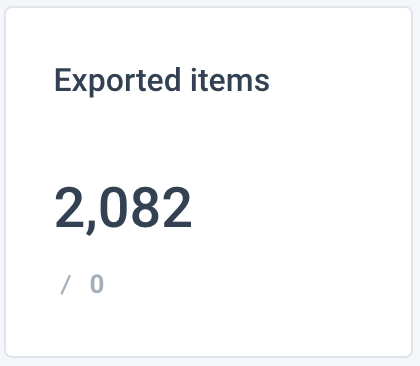 |
The warnings and errors tile shows the number of warnings and errors during the last run. The numbers below show the difference from the previous run and if it increased or decreased. You can see the number of errors by severity level on the right side. To see more details on warnings and errors, select the link View error log. See Error log for information on Error Log codes. 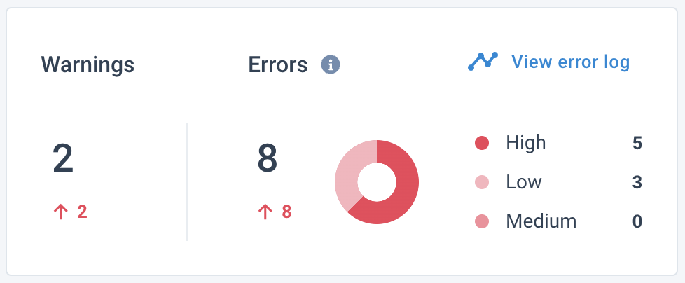 | |
Core readiness score tile
The Core readiness score tile shows the percentage of attributes that pass analyzer tests for every export set up and activated in your site.
Note
In this tile, the dashboard displays only exports that have analyzer tests.
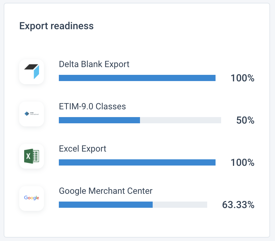
To see a newly added export in the Core readiness score tile, you need to:
Set up and activate a destination.
Map attributes to the new export in Dataflow.
Do one of the following:
Start a full site run. It should finish without errors for the dashboard to display the new export in Core readiness score.
Export the newly added export only. This partial export run should finish without errors for the dashboard to display the new export in Core readiness score.
Go to Data View, switch to Full View in the top toolbar, and then select Refresh.
Site run times tile
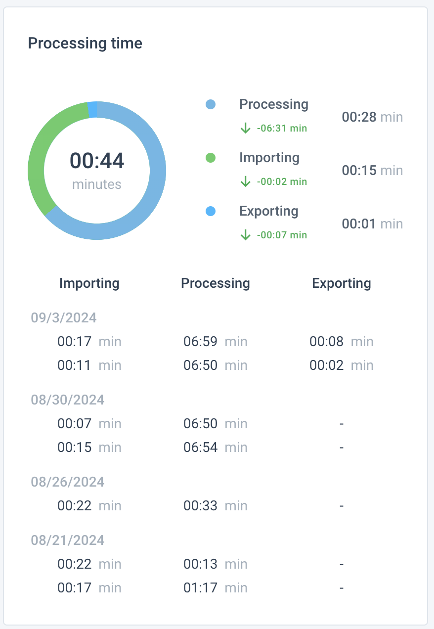
The Site run times tile shows how long it took to complete the last run, with a breakdown of each part of the run: importing, processing, and exporting. This tile shows both partial and full site runs.
In the chart, you can see the overall duration of the run. To the right, you can see a breakdown of the run and deviations from the previous run.
Below the chart, the tile breaks down a number of previous site runs with detailed timing for each part of the run and the date when the run took place. If you see a hyphen - in a column dedicated to a specific part of a run, it means the run didn't involve this process.
Import and export history graphs
Before analyzing the information provided in the import and export history graphs, you can use the following graph controls:

20 runs displays a graph for the last 20 runs of this site.
100 runs displays a graph for the last 100 runs of this site.
Show only full runs displays both full and partial site runs in the graph if turned off. If set to on, it removes partial runs from the graph.
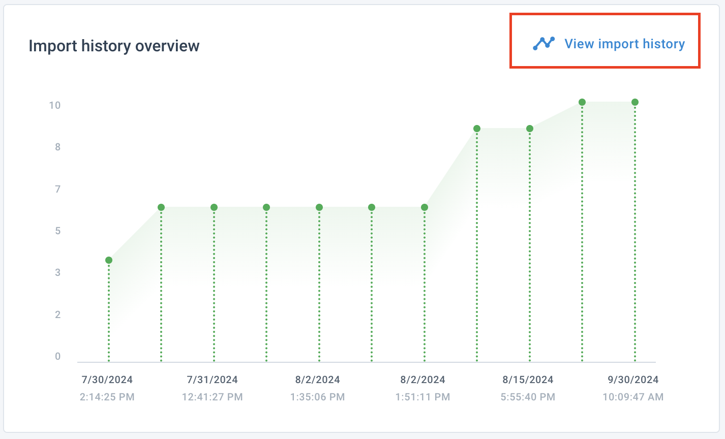
The Import history overview graph visualizes how the number of imported items changed over time. To get more details on a specific import, you can:
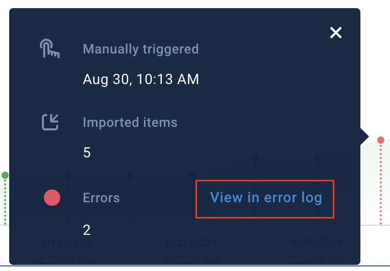
Select a specific vertical bar on the graph to open a tooltip. Green bars mean successful import runs, and red bars mean import runs with errors. The tooltip shows the run's type, date, time, and the number of imported items. In case of a red bar, you can also see the number of errors and the link View in Error Log that takes you to the errors of this specific run in Error Log.
Select View import history to open the Import History tab in Data Sources for a complete overview of the site's imports.
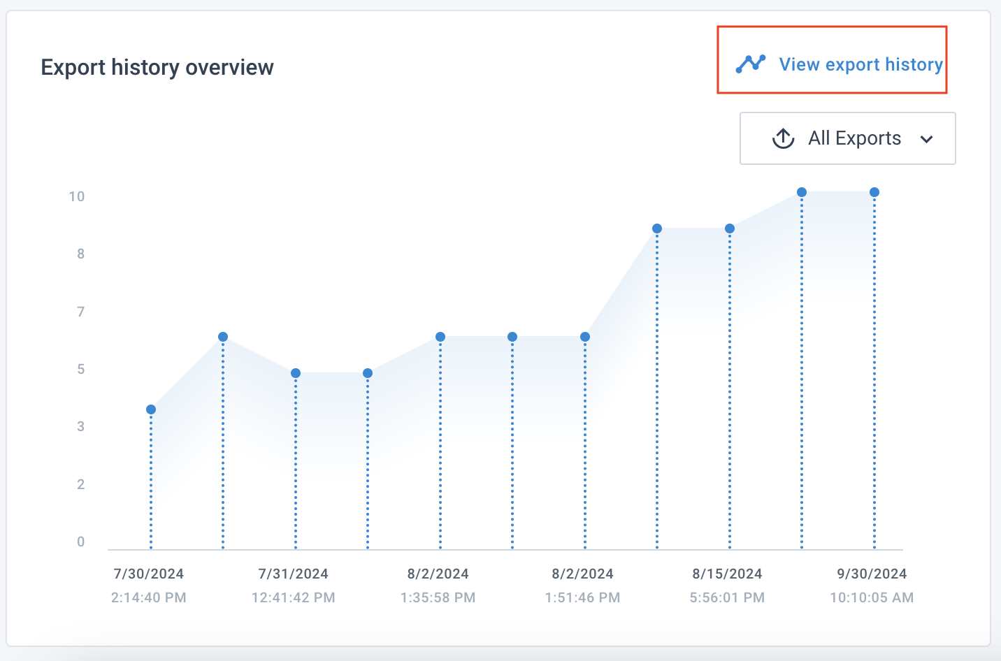
The Export history overview graph visualizes how the number of exported items changed over time. To get more details on the specific export run, you can:
Select a specific export from All exports to focus on its stats.
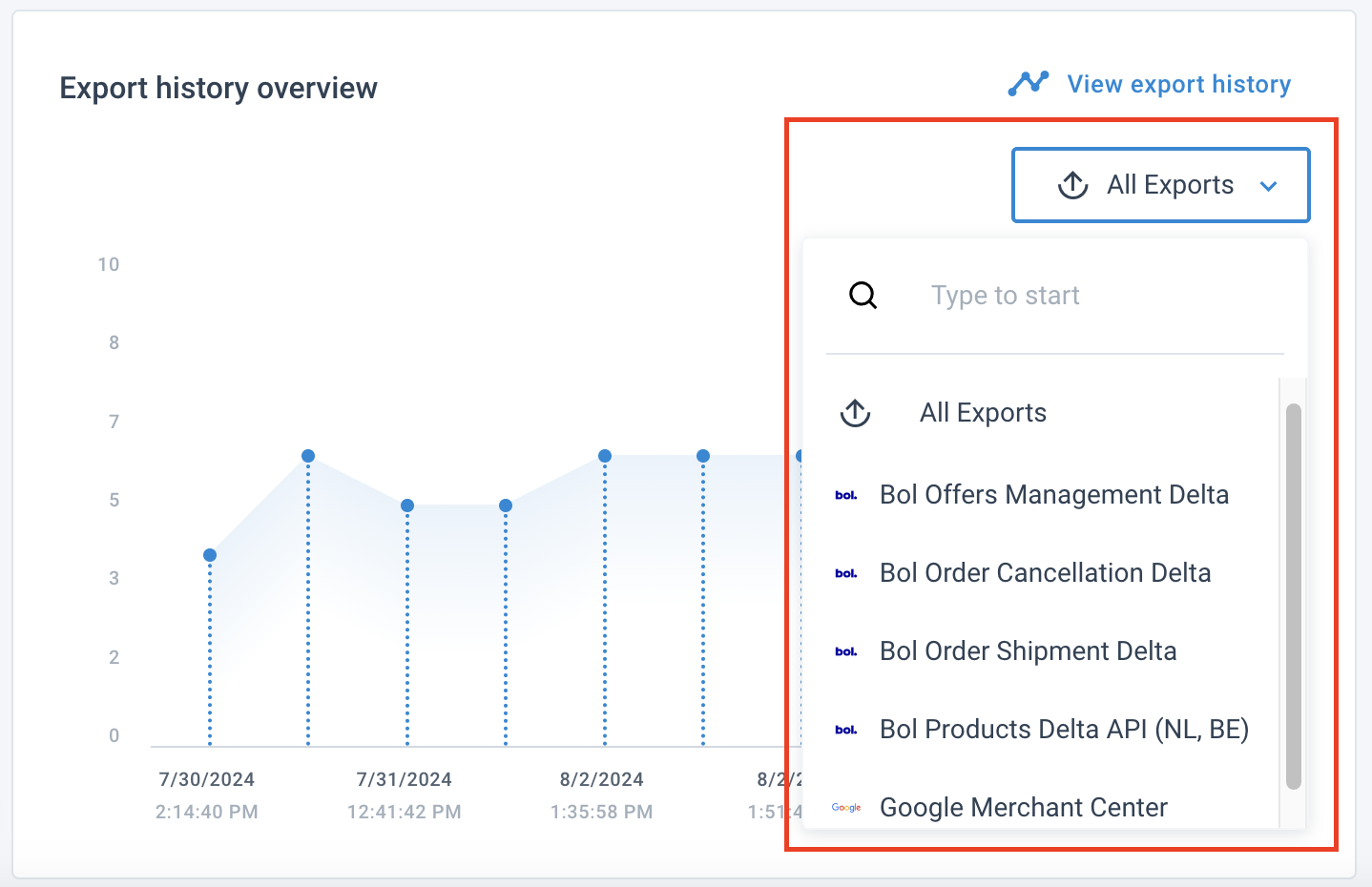
Select a specific vertical bar on the graph to open a tooltip. Blue bars mean successful export runs, and red bars mean export runs with errors. The tooltip shows the run's type, date, time, and the number of exported items. In case of a red bar, you can also see the number of errors and the link View in Error Log that takes you to the errors of this specific run in Error Log.
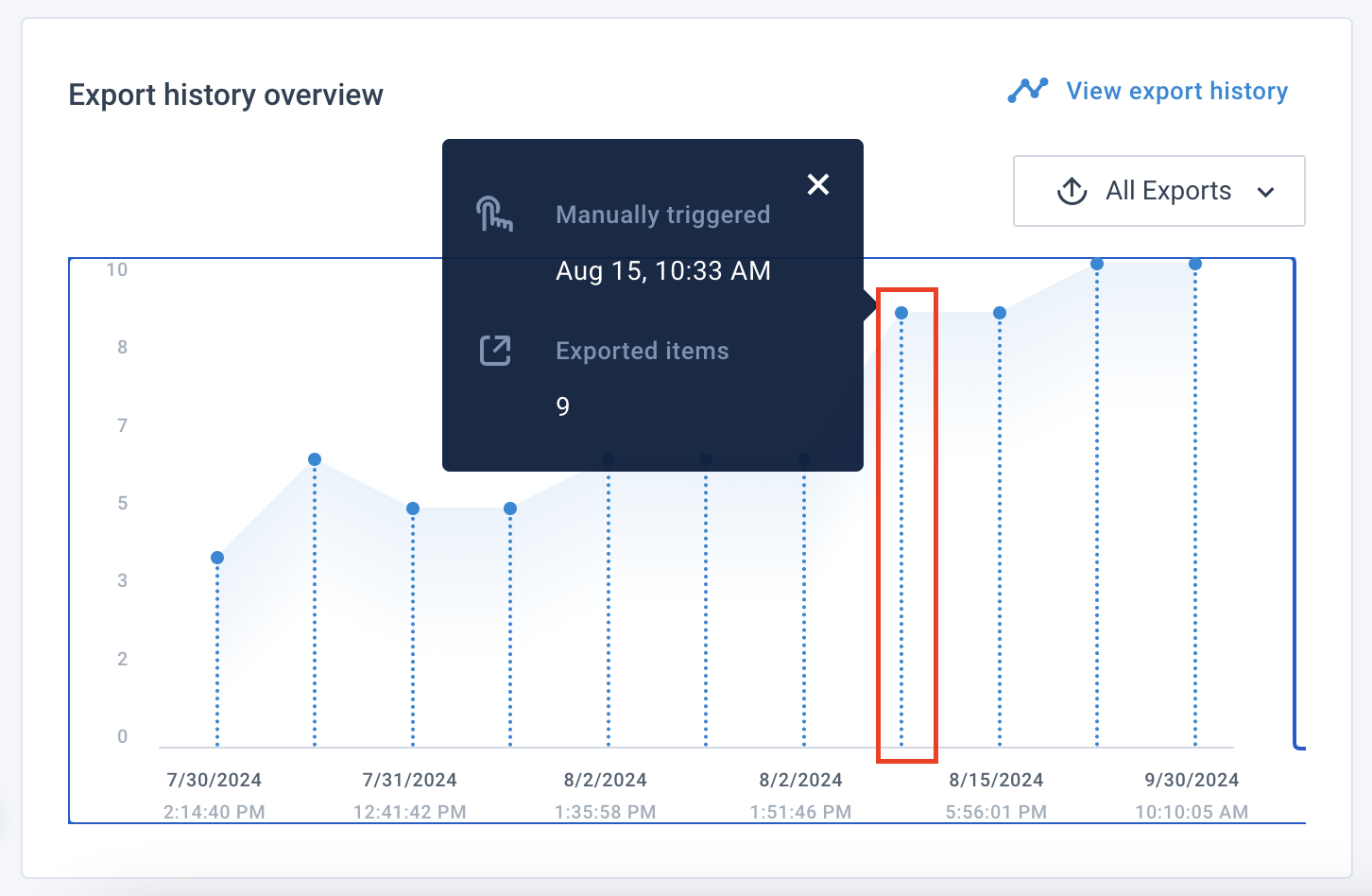
Select View export history to open the Export history tab in Exports for a complete overview of the site's export runs.
