Rule box category Edit image
Use the rule box category Edit image to optimize images in your data by applying rule boxes in Productsup.
Introduction
The category Edit image contains all rule boxes that can help you create and edit an image in Productsup. Using the rule boxes in this category, you can add a logo, cart, rating, or other image to your existing images, create a collage with relevant product images, and trim, resize, or rotate images.
In many Edit image rule boxes, you can find the following terms:
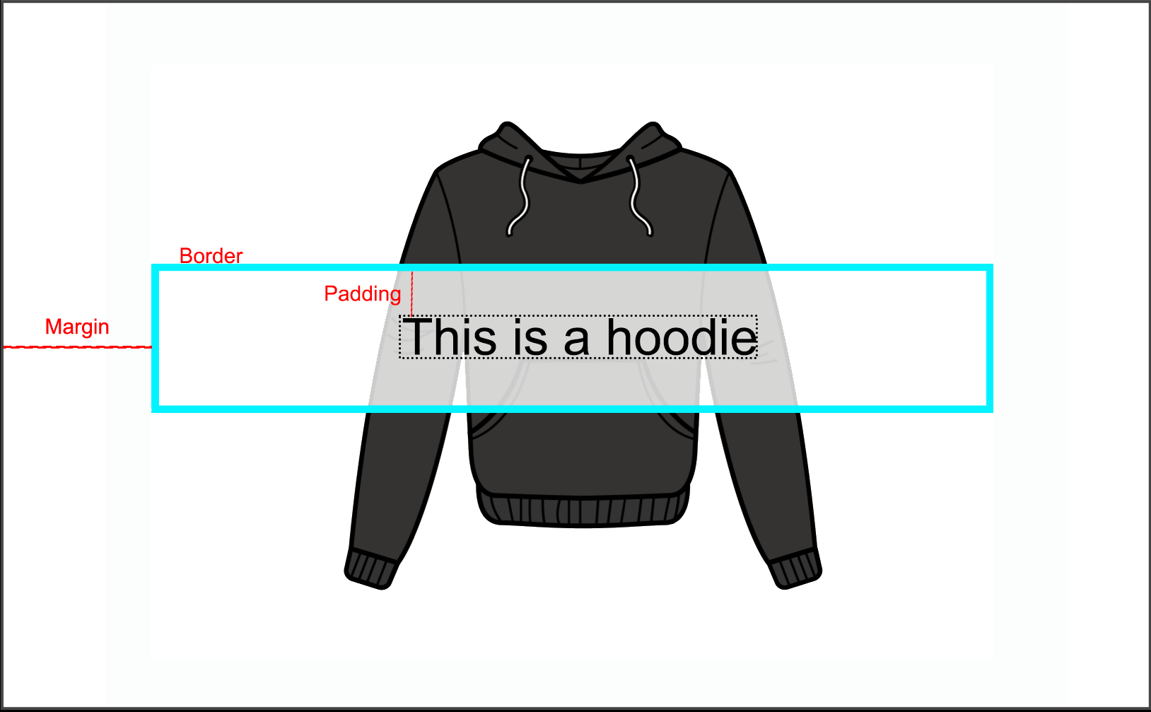
Padding is a space between the content and the border of the defined area.
Border is a frame around the defined area.
Margin is a space outside the defined area.
Add Cart Image
The Add Cart Image rule box lets you include an icon with a call-to-action (CTA) to prompting the customer to add a product to the cart.
Take the steps from Add a rule box to add the Add Cart Image rule box.
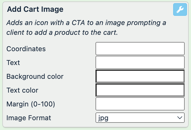
Select Coordinates to open the coordinates field and define the area where you want to locate your cart icon.
In Text, enter a static text that should appear on the cart icon.
In Background color, define the color of the area of the cart icon.
In Text color, pick the cart icon text color.
In Margin (0-100), define the margin outside of your cart icon.
In Image Format, select the type of the result image: jpg or png.
Select Save.
For example, you have the following image in your image attribute and want all images have the icon Add to cart! in the top corner. You can achieve this with the following setup of the Add Cart Image rule box:
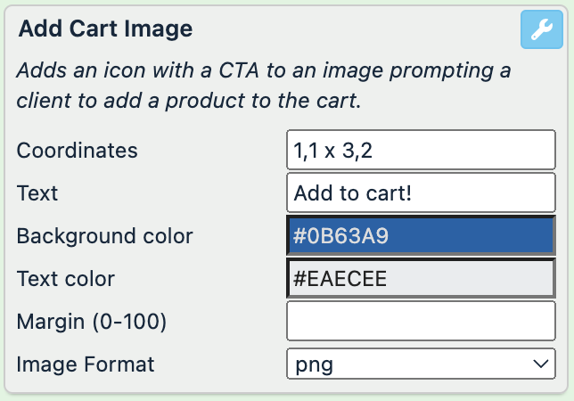
image (before) | image (after) |
|---|---|
 |  |
Add Image
The Add Image rule box lets you add a static or dynamic image on top of your original image.
Take the steps from Add a rule box to add the Add Image rule box.
Select Coordinates to open the coordinates field and define the area where you want to locate your image.
To select an image that you want to put on top of the original image, use one of the options:
To add an image from the outside of your imported data, enter the URL of the desired image in Source.
To add an image from another attribute, select the attribute containing your desired images in Or Image Column
In Transparency (0-100), select the transparency of the added image on a scale from 0 to 100, where 0 is non-transparent and 100 is fully transparent.
In Zoom, choose among different zoom methods: a combination of Top, Middle, or Bottom with Center, Left, or Right to decide which parts of your image to crop away.
In Padding (0-100), define the amount of padding within the selected area, where 0 is no padding.
In Align Within Selection, select the alignment type of your image: a combination of Top, Middle, or Bottom with Center, Left, or Right.
In Image Format, select the type of the result image: jpg or png.
Select Save.
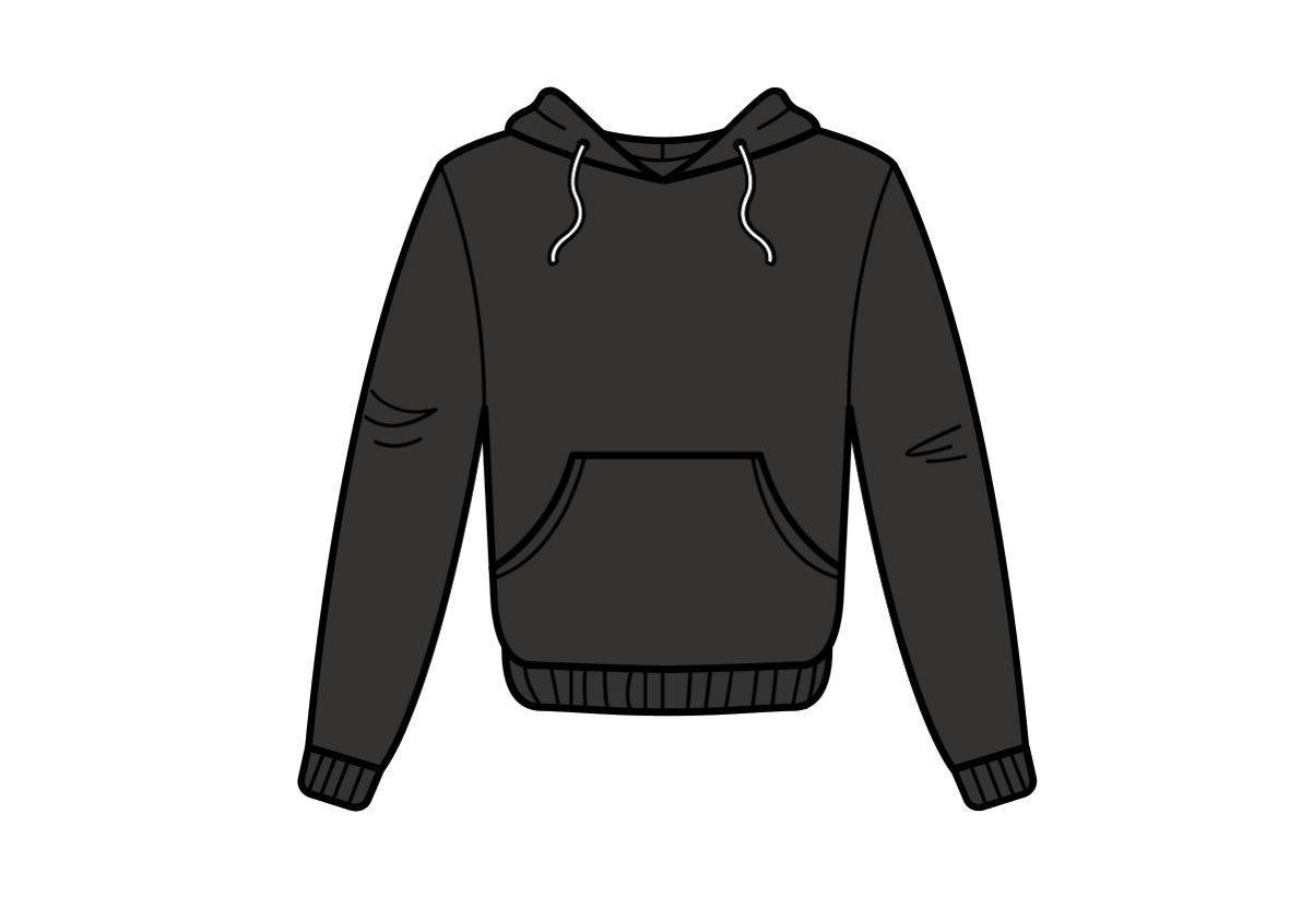
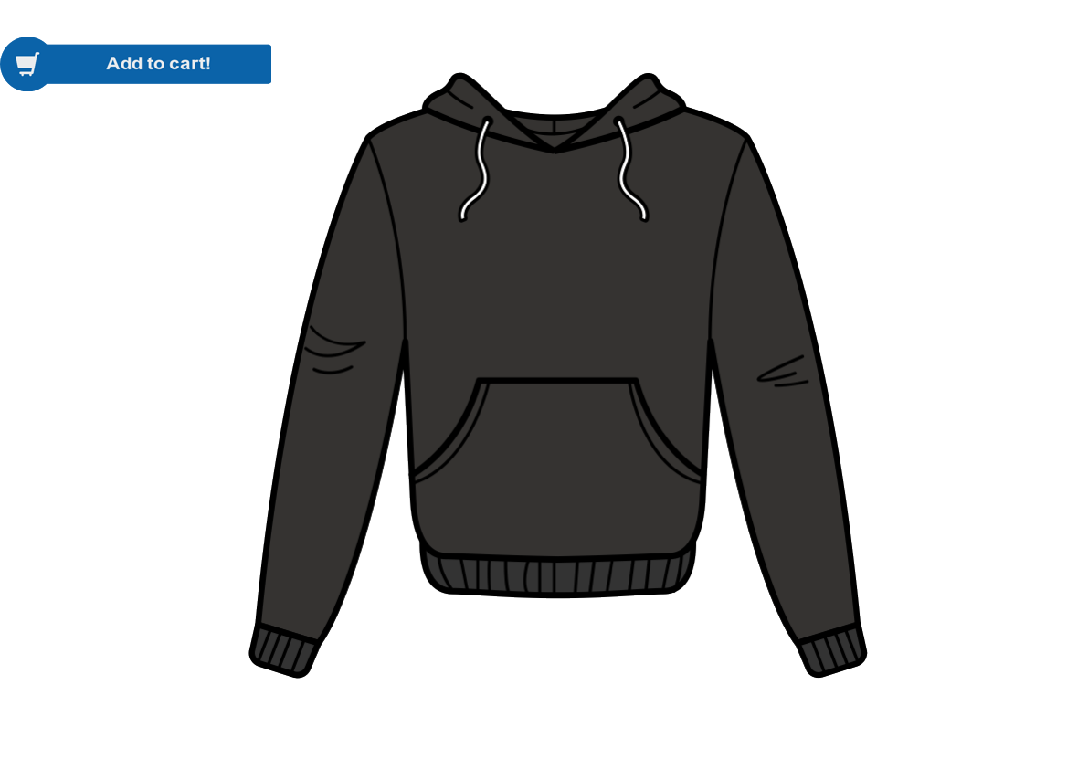
For example, you have the following image in your image attribute and want all images have a social media icon on it. You can achieve this with the following setup of the Add Image rule box:
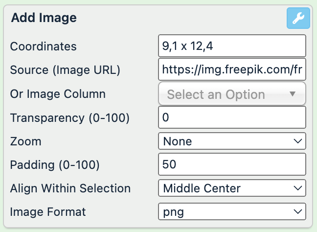
image (before) | image (after) |
|---|---|
| 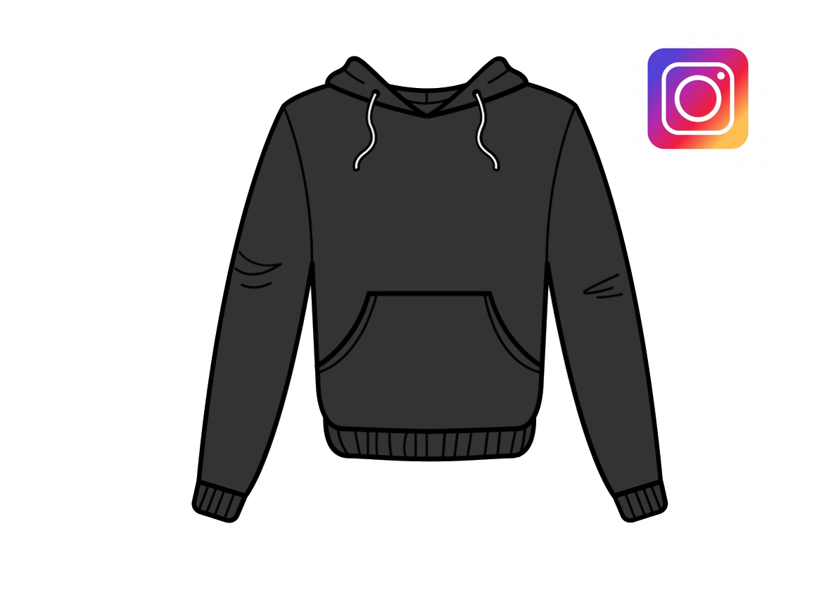 |
Add Image From Column
The Add Image From Column rule box lets you add a static or dynamic image on top of your original image.
Take the steps from Add a rule box to add the Add Image From Column rule box.
Select an attribute that contains the images in Column.
Select Save.
For example, you have the following image in your image attribute and want to add its URL to the description attribute. You can achieve this with the Add Image From Column rule box by selecting the image attribute in Column:
image (no changes) | description (before) | description (after) |
|---|---|---|
| Black hoodie with a pocket |
|
The platform automatically adds a comma without a space before the following image URL.
Add Image Layer
The Add Image Layer rule box lets you add a colored layer on top of an image as a canvas for a further text.
Take the steps from Add a rule box to add the Add Image Layer rule box.
Select Coordinates to open the coordinates field and define the area where you want to locate your layer.
Select the Color field to pick the desired color of the layer or enter a hex color code or select an attribute that contains the a hex color codes in Color Column.
In Transparency (0-100), select the transparency of the added layer on a scale from 0 to 100, where 0 is non-transparent and 100 is fully transparent.
In Border width (px), define the width of the border separating the layer from the image.
In Border color, define the color of the border by picking the color in the color scheme or by entering a hex code.
In Border opacity, select the opacity of your border on a scale, where 0 is full opacity and 100 is no opacity.
In Border position, select the position of the border in relation to the layer:
Center adds the border on top of the layer's edges.
Outside adds the border outside the layer's edges.
Inside adds the border inside the layer's edges.
In Margin (px), define the margin outside the layer.
Select Save.
For example, you have the following image in your image attribute and want to add layer on top of it. You can achieve this with the following setup of the Add Image Layer rule box:
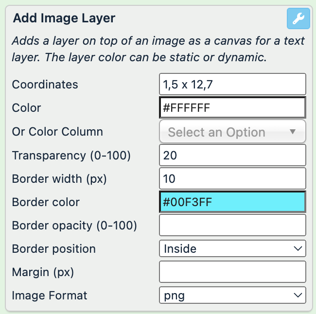
image (no changes) | image (after) |
|---|---|
|  |
Add Logo To Image
The Add Logo To Image rule box lets you add a static or dynamic logo on an image.
Take the steps from Add a rule box to add the Add Logo To Image rule box.
Enter the URL where you store your logo in Logo URL, or select an attribute that contains your logos in Logo Column.
In Position from Top and Position from Left, define the logo position on the image. The rule box divides the image into five clusters from top to bottom and from left to right.
In Logo Width, select the percentage of the logo width.
In Rotate (clockwise), rotate the logo clockwise on 90, 180, or 270 degrees.
In Resize (width) and Resize (height), select the size of the resulting image.
In Grid, select show to see the grid that may help you to position your logo. Don't forget to hide it before saving the final image.
Select Save.
For example, you have the following image in your image attribute and want to add a logo in the corner. You can achieve this with the following setup of the Add Logo To Image rule box:
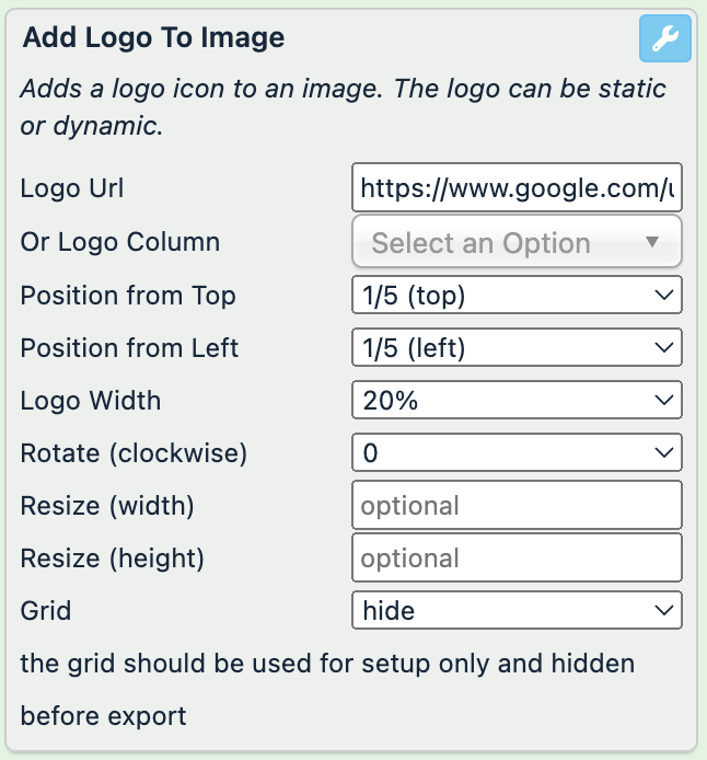
image (before) | image (after) |
|---|---|
| 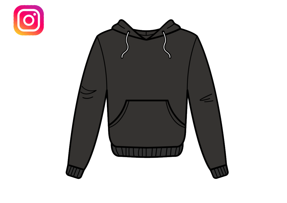 |
Add Rating Image
The Add Rating Image rule box lets you add a star rating icon to an image.
Take the steps from Add a rule box to add the Add Rating Image rule box.
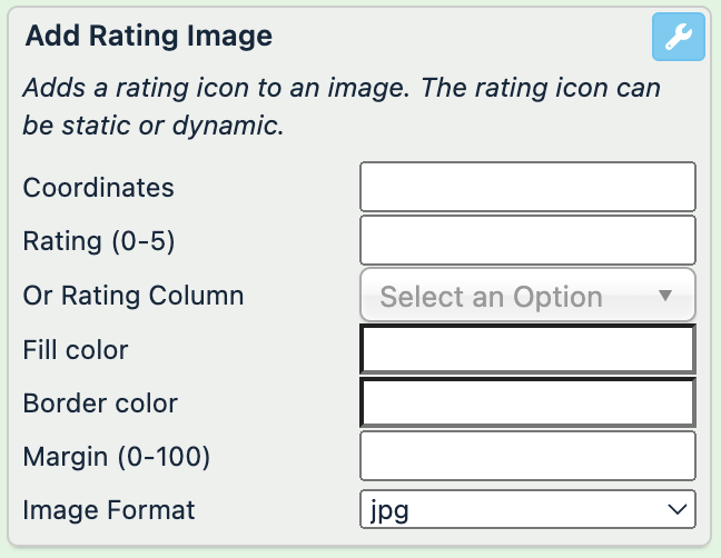
Select Coordinates to open the coordinates field and define the area where you want to locate your rating icon.
Enter the number of the rating stars from 0 to 5 in Rating (0-5), or select an attribute that contains ratings in Rating Column.
In Fill folor, pick the filling color of the rating stars in the color scheme or by entering the hex code.
In Border color, define the color of the ratings stars' border by picking the color in the color scheme or by entering the hex code.
In Margin (0-100), define the margin outside the rating stars.
In Image Format, select the type of the result image: jpg or png.
Select Save.
For example, you have the following image in your image attribute and want to add the rating stars on the image. You can achieve this with the following setup of the Add Rating Image rule box:
image (before) | image (after) |
|---|---|
| 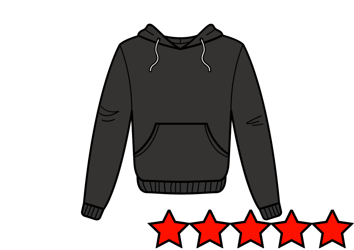 |
Add Text To Image
The Add Text To Image rule box lets you add text to a desired place on an image.
Take the steps from Add a rule box to add the Add Text To Image rule box.
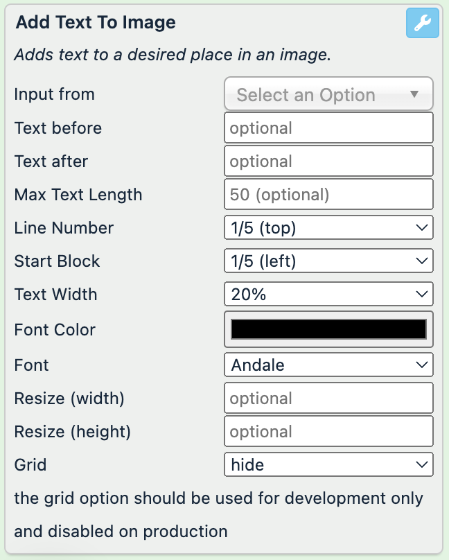
Select the attribute that contains the text you want to place on the image in Input from.
Optionally, in Text before, enter a text you want to add before the text from the attribute.
Optionally, in Text after, enter a text you want to add after the text from the attribute.
Optionally, in Max Text Length, enter the maximum number of characters that your added text can contain.
In Line Number and Start Block, define the text position on the image. The rule box divides the image into five clusters from top to bottom and from left to right.
In Text Width, select the percentage of the text width.
In Font Color, select the text color by picking the color in the color scheme or by entering the hex code.
Select the desired text font in Font.
In Resize (width) and Resize (height), select the size of the resulting image.
In Grid, select show to see the grid that may help you to position your text. Don't forget to hide it before saving the final image.
Select Save.
For example, you have the following image in your image attribute and want to add text on the image from brand. You can achieve this with the Add Text To Image rule box:
brand (no change) | image (before) | image (after) |
|---|---|---|
MyBrand | | 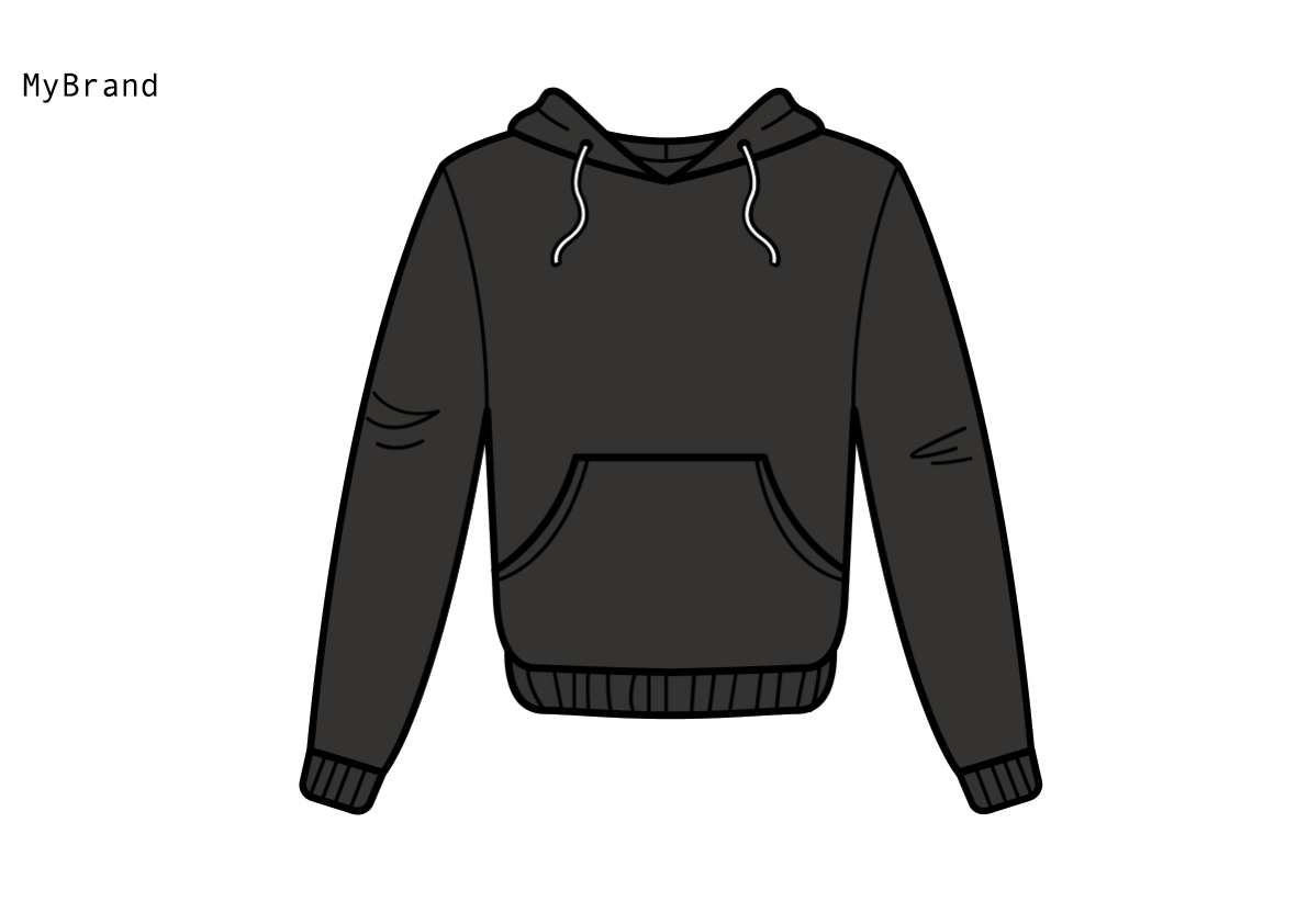 |
Add Text to Image Coordinates
The Add Text to Image Coordinates rule box lets you add a text to a desired place in an image.
Take the steps from Add a rule box to add the Add Text to Image Coordinates rule box.
Select Coordinates to open the coordinates field and define where you want to locate your text.
Select the attribute that contains the text you want to place on the image in Input from.
Optionally, in Text Before, enter a text that you want to add before the text from the attribute.
Optionally, in Text After, enter a text that you want to add after the text from the attribute.
Optionally, in Max Text Length, enter the maximum number of characters that your added text can contain.
In Font Color, select the text color by picking the color in the color scheme or entering the hex code.
Select the desired text font in Font.
In Align, add the type of the text alignment: Left, Center, or Right.
In Padding (0-100), define the amount of padding within the selected area, where 0 is no padding.
In Max Font Size (px), define a maximum font size when you add multiple texts to ensure all texts have the same size.
In Image Format, select the type of the result image: jpg or png.
Select Save.
For example, you have the following image in your image attribute and want to add the information about the available sizes on the image from size. You can achieve this with the following setup of the Add Text to Image Coordinates rule box:
size (no change) | image (before) | image (after) |
|---|---|---|
L | | 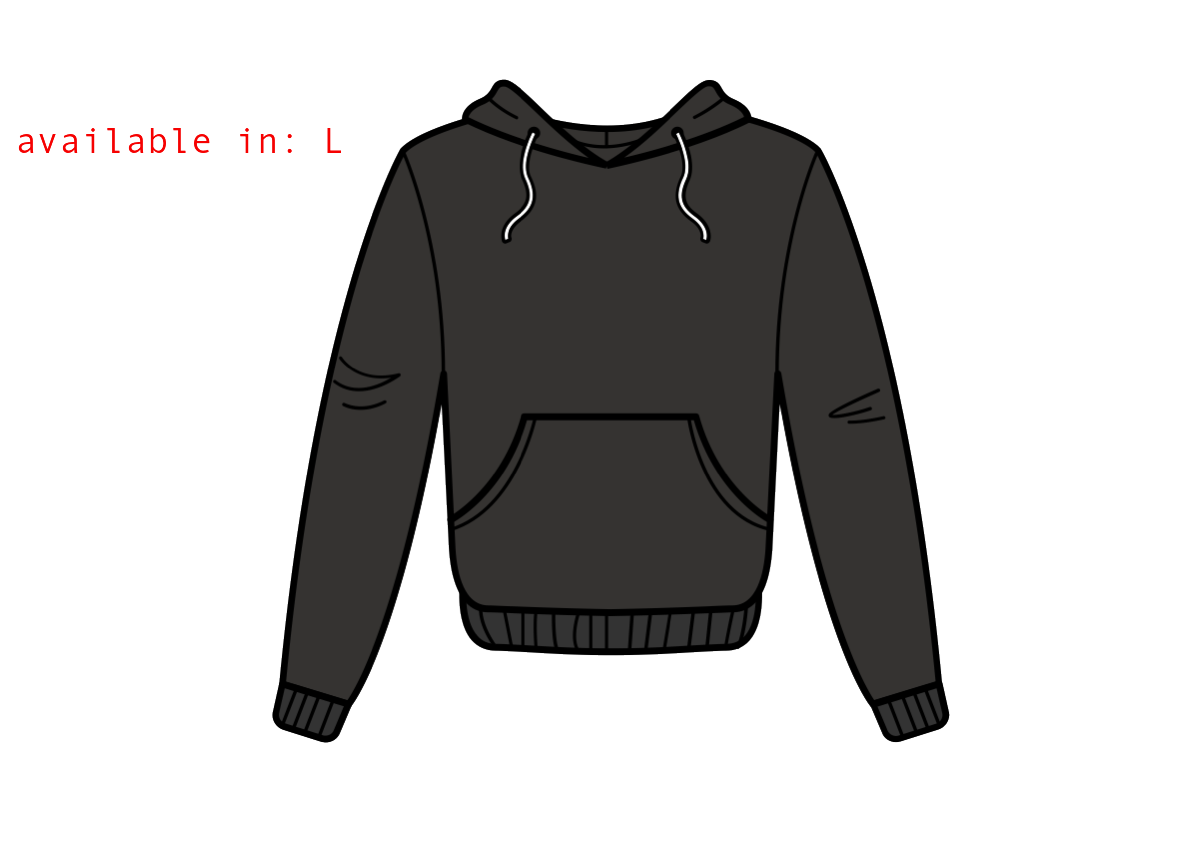 |
Add URL Fragment
A URL fragment is an internal page reference that appears at the end of a URL and begins with a hash character (#) followed by an identifier. It refers to a section within a web page.
The Add URL Fragment rule box lets you add a static fragment at the end of all URLs in a current attribute:
Take the steps from Add a rule box to add the Add URL Fragment rule box.
Enter a desired fragment in Fragment (without #).
Select Save.
For example, you have the following values in the URL attribute and want to add the #section-1 fragment to all links. You can achieve this with the Add URL Fragment rule box by entering section-1 in Fragment (without #):
URL (before) | URL (after) |
|---|---|
https://www.amazon.com/Fluffy-Pajama-Pants-Green/dp/G00PJSF1UF |
|
https://www.amazon.com/Warm-Wool-Socks-Red/dp/R00SCKS1WO?currency=EUR&utm_medium=product_sync&utm_source=google&utm_campaign=search_organic |
|
Create Image
The Create Image rule box lets you change any value in the attribute into a colored canvas that works as a basis for an image. You can use other edit image rule boxes to edit the image further.
Take the steps from Add a rule box to add the Create Image rule box.
In Width (px), define the canvas width in pixels.
In Height (px), define the canvas height in pixels.
Select the Color field to pick the desired canvas color, enter a hex color code or select an attribute that contains the a hex color codes in Or Color Column.
In Image Format, select the type of the resulting image: jpg or png.
Select Save.
For example, you have an empty image attribute and want to create images instead. You can achieve this with the following setup of the Create Image rule box:
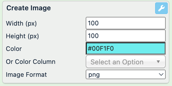
image (before) | image (after) |
|---|---|
 |
Mosaic Template
The Mosaic Template rule box lets you create a collage using images from the selected attributes.
Tip
You can add the Create Image rule box to create a canvas first. See Create Image.
Take the steps from Add a rule box to add the Mosaic Template rule box.
In Zoom, define what part of the image you want to zoom by choosing among different zoom methods: a combination of Top, Middle, or Bottom with Center, Left, or Right. Or leave None not to zoom the image.
In Orientation, select the collage orientation:
Portrait arranges the additional images below the main image.
Landscape arranges the additional images on the right from the main image.
In Image Column 1, select the attributes where the rule box should take the main image.
In Image Column 2-6, select the attributes from which the rule box should take the additional images.
In Image Format, select the type of the resulting image: jpg or png.
Select Save.
For example, you want to have a collage of several images from the same attribute. You can achieve this with the following setup of the Mosaic Template rule box:
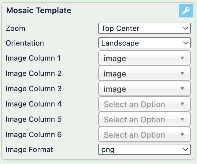
image (before) | image (after) |
|---|---|
| 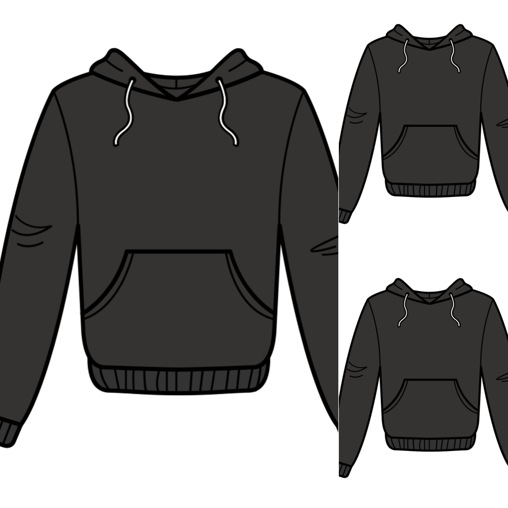 |
Resize Image
The Resize Image rule box lets you resize, zoom, change the format, and add a colored background to an image.
Take the steps from Add a rule box to add the Resize Image rule box.
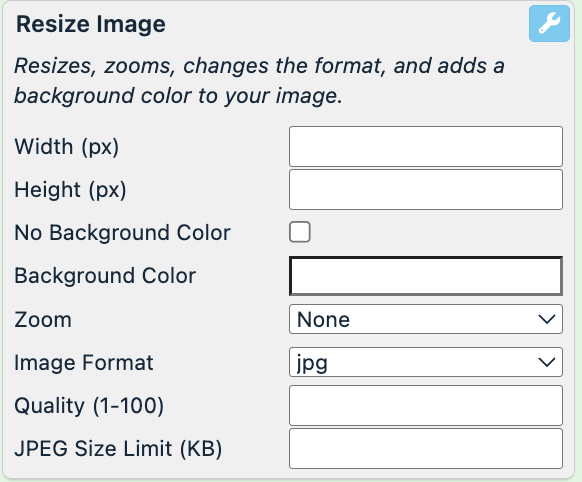
In Width (px), define the canvas width in pixels.
In Height (px), define the canvas height in pixels.
Select No Background Color if you don't want to add any background or select the Background Color field to pick the desired color or enter a hex color code.
Select Padding to add the space between the objects in your image and the outer edge of your image. The platform adds padding to reach the size defined in Width and Height. For example, if a source image is 600x600 px and you want to modify it to 600x800 px, when you select Padding, the platform adds 0x200 px. The padding color is the same as in Background Color.
In Zoom, define what part of the image you want to zoom by choosing among different zoom methods: a combination of Top, Middle, or Bottom with Center, Left, or Right. Or leave None not to zoom the image.
In Image Format, select the type of the result image: jpg or png.
In Quality, enter the quality percentage of the output JPEG image to reduce the weight. The value can range from 0 to 100.
In JPEG Size Limit (KB), enter the kilobyte limit of the output JPEG image to reduce the weight of the output image.
Select Save.
For example, you want to resize the images and change their background color in the image attribute. You can achieve this with the following setup of the Resize Image rule box:
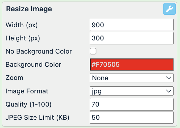
image (before) | image (after) |
|---|---|
|  |
Rotate Image
The Rotate Image rule box lets you resize, mirror, change the format, and add a colored background to an image.
Take the steps from Add a rule box to add the Resize Image rule box.
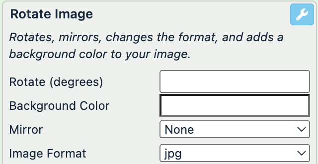
In Rotate (degrees), define the angle of rotation.
Select the Background Color field to pick the desired color or enter a hex color code. If you don't select any color, the background becomes white.
In Mirror, select whether you want to mirror your images by choosing among None, Flip (x-axis), or Flop (y-axis).
In Image Format, select the type of the resulting image: jpg or png.
Select Save.
For example, you want to rotate the images and change their background color in the image attribute. You can achieve this with the following setup of the Rotate Image rule box:
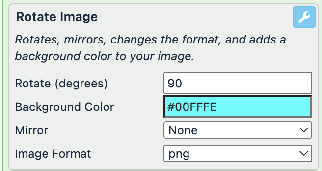
image (before) | image (after) |
|---|---|
| 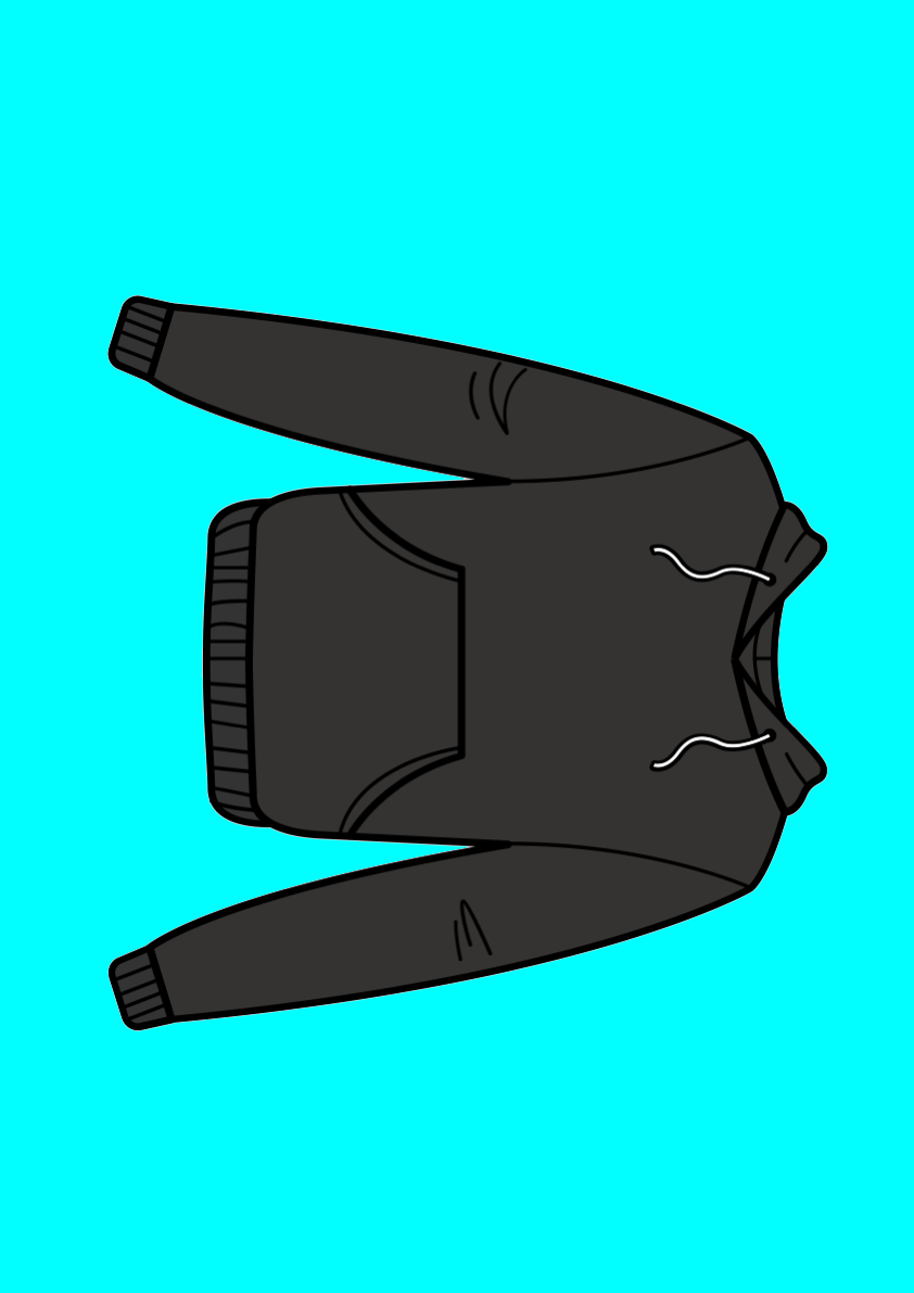 |
Separate Link and Take First Image
The Separate Link and Take First Image rule box lets you leave only the first image and remove all other comma-separated images from the attribute.
Take the steps from Add a rule box to add the Separate Link and Take First Image rule box.
In Delimiter, define the delimiter that separates your images.
Select Save.
For example, you have several images in the image attribute and want to leave only the first image for each item. You can achieve this with the Separate Link and Take First Image rule box:
image (before) | image (after) |
|---|---|
https://yourdomain.com/image/product/12345.jpg,http://yourdomain.com/image/product/45678.jpg |
|
Separate Link and Take Last Image
The Separate Link and Take Last Image rule box lets you remove the first image and leave the rest of the comma-separated images in the attribute.
Take the steps from Add a rule box to add the Separate Link and Take Last Image rule box.
In Delimiter, define the delimiter that separates your images.
Select Save.
For example, you have three (3) images in the image attribute and want to remove only the first image for each item and leave the rest two (2) images. You can achieve this with the Separate Link and Take First Image rule box:
image (before) | image (after) |
|---|---|
http://yourdomain.com/image/product/55555.jpg,https://yourdomain.com/image/product/12345.jpg,http://yourdomain.com/image/product/45678.jpg | https://yourdomain.com/image/product/12345.jpg,http://yourdomain.com/image/product/45678.jpg,https://yourdomain.com/image/product/12345.jpg,http//:yourdomain.com/image/product/45678.jpg,https://yourdomain.com/image/product/12345.jpg,http://yourdomain.com/image/product/45678.jpg |
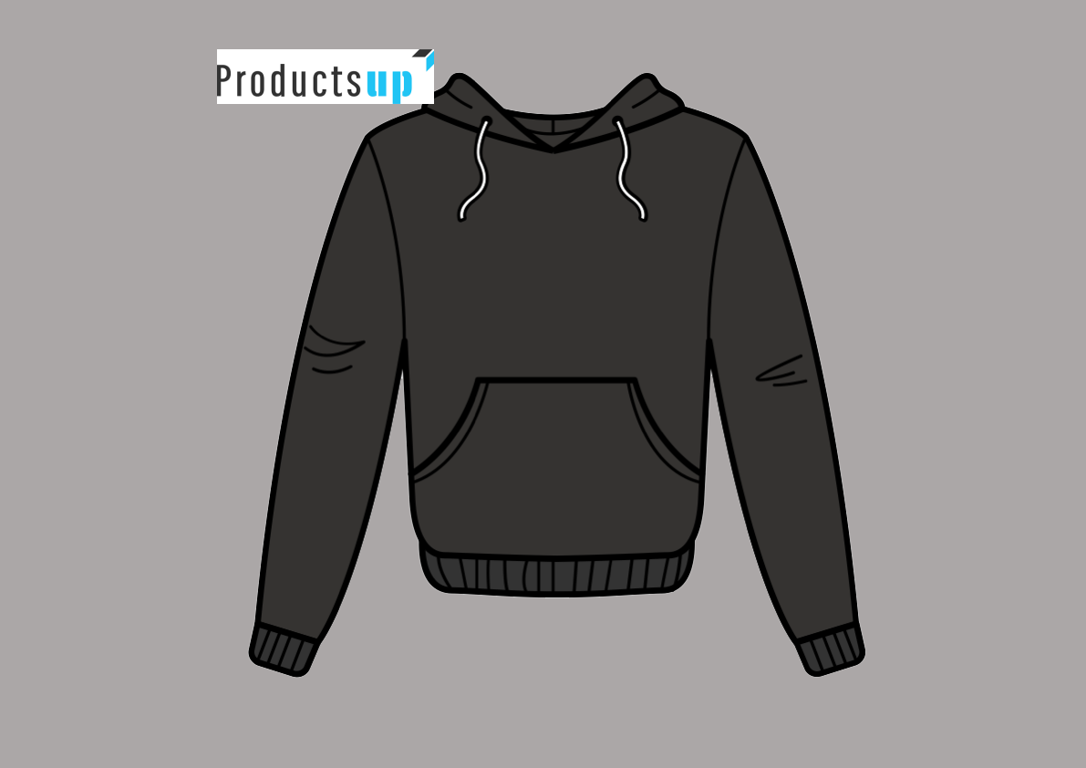
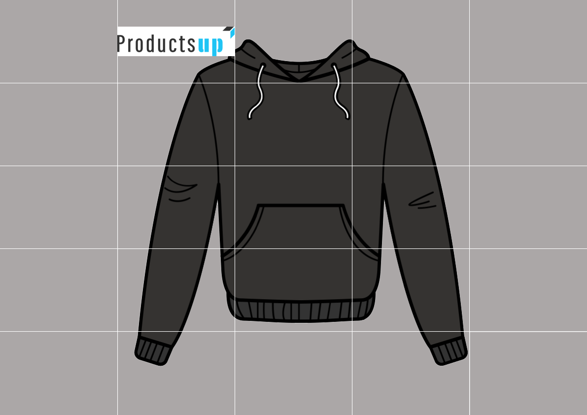
Show Grid Image
The Show Grid Image rule box lets you apply a grid over the images to let you see the position of the image elements. The grid only appears in the preview and disappears in the exported image.
Note
Place this rule box below all other rule boxes to let it work properly.
Take the steps from Add a rule box to add the Show Grid Image rule box.
In Grid, select show to see the grid that may help you position your image elements. Remember to hide it before saving the final image.
In Image Format, select the type of the resulting image: jpg or png.
Select Save.
For example, you have the following image in your image attribute and want to see the grid to check the position of your image elements. You can achieve this with the Show Grid Image rule box:
image (before) | image (after) |
|---|---|
 |  |
Trim Image
The Trim Image rule box removes the useless space around your product image.
Take the steps from Add a rule box to add the Trim Image rule box.
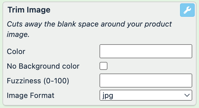
Select the Color field to pick the desired background color or enter a hex color code.
Select No Background color if you don't have any background color.
In Fuzziness (0-100), define the trim fuzziness from 0 to 100, where 0 means only the exact same color code as you selected in Color, and 100 removes the range of the shades similar to the selected color.
In Image Format, select the type of the resulting image: jpg or png.
Select Save.
Note
If you have an image without a background, the color that you select in the Color field fills your image background. You don't need to set any fuzziness in this case.
For example, you want to remove all unused space and add a red background in your images. You can achieve this with the Trim Image rule box:
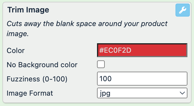
image (before) | image (after) |
|---|---|
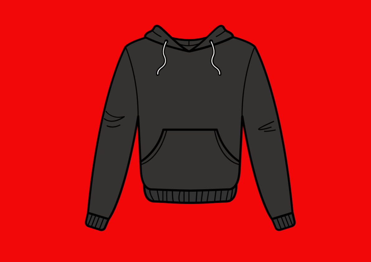 | 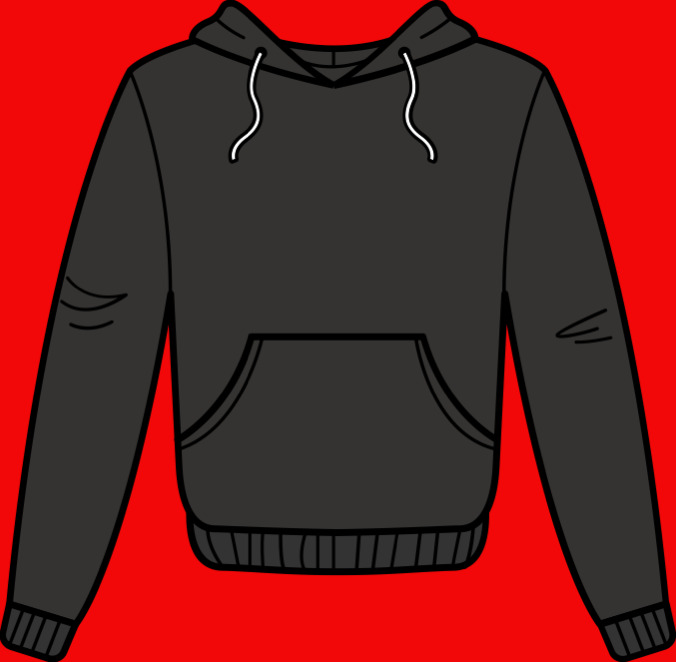 |
Trim Image Border
The Trim Image Border rule box removes the border from your images.
Note
Your images must have borders to let this rule box work properly.
Take the steps from Add a rule box to add the Trim Image Border rule box.
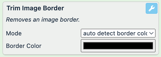
In Mode, select one of two options:
auto detect border color: use this option if you don't know the border color.
trim selected border color: use this option if you know the border color.
Select the Border Color field to pick the color or enter a hex color code.
Select Save.
For example, you have the following image in your image attribute and want to remove the border. You can achieve this with the Trim Image Border rule box:
image (before) | image (after) |
|---|---|
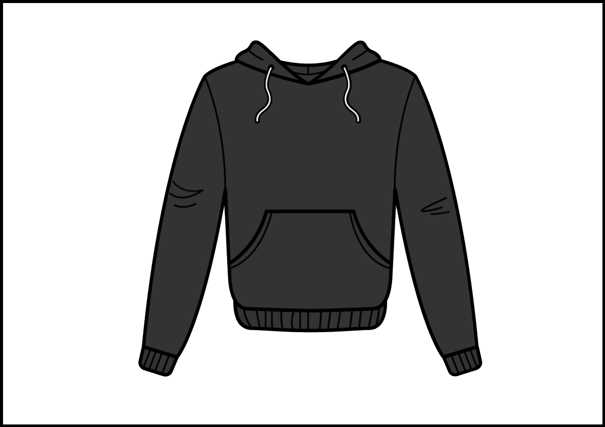 | |
Use Image Designer Template
The Use Image Designer Template rule box lets you apply some ready Image Designer templates to your images if you have only a limited Image Designer version. This rule box lets you test the Image Designer functionality on a limited number of images. See Create and apply custom image templates.
Take the steps from Add a rule box to add the Use Image Designer Template rule box.
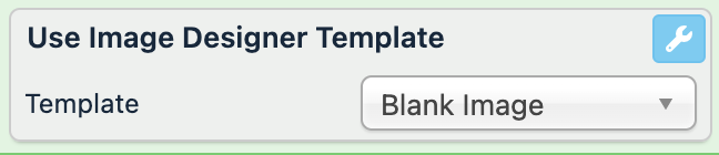
In Template, select one of the templates.
Select Save.
Important
When you modify images, they go through the Productsup image servers.
Each time you change and apply a template, the URL of the exported image changes and starts with https://gfx.productsup.io/.
Use Image Designer Template from Attribute
The Use Image Designer Template from Attribute rule box lets you apply a particular image template for a specific product by reading the template name from a selected attribute in the data. Before using this rule box, ensure that your imported data contains an attribute with the image templates names.
Note
To use this rule box, you need the Image Designer feature activated in your organization. To activate Image Designer, contact your Customer Success Manager.
Take the steps from Add a rule box to add the Use Image Designer Template from Attribute rule box.
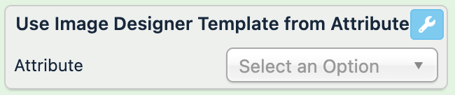
In Attribute, select the attribute that contains the templates names. The attribute comes from a previous stage. The attribute's values with the template names must match to the template names you create in Image Designer. The values are case insensitive.
Select Save.
For example, to add a template to your images, you need to add the rule box Use Image Designer Template from Attribute to your image link attribute and select the image template attribute containing the template names corresponding to each product ID, such as:
id | image template |
|---|---|
1 | Christmas |
2 | Warm Socks |
3 | Last Pair |